📕 - 2024
Next Read
Overview
"Next Read" is a user-centered book discovery platform designed to help readers navigate the overwhelming selection of books available today. The project was developed as part of my Master's dissertation, focusing on improving the digital book selection experience through research-driven design thinking. By leveraging user insights, competitive analysis, and iterative prototyping, I created an intuitive, personalized, and engaging way for users to explore books based on their preferences.

Problem Statement
With countless books available across various platforms, readers often experience decision fatigue when selecting their next read. Factors such as genre preferences, mood, cover design, and social influence play crucial roles in book selection. However, existing book recommendation platforms lack intuitive, personalized, and engaging methods to explore new books effectively.
Challenges Identified:
Overwhelming book choices leading to decision fatigue.
Lack of personalized recommendations based on individual reading moods.
Over-reliance on generic book reviews, which may not reflect personal taste.
Ineffective filtering and categorization of books based on specific user needs.
Missing community-driven discovery elements for engagement and interaction.

Research & Design Approach
To address these challenges, I followed a User-Centered Design (UCD) approach, incorporating both primary and secondary research to gain a deep understanding of user behavior and industry trends.
Research Phase
1. Primary Research
Conducted online surveys with 14 book readers to understand selection habits, frustration points, and expectations from book recommendation apps.
Identified key factors influencing book selection, including mood-based preferences, social recommendations, and visual appeal.
Evaluated user pain points related to existing book discovery platforms.
2. Secondary Research
Analyzed competitor platforms like Goodreads, The StoryGraph, BookBub, LibraryThing and TBR Bookshelf to study existing features and their limitations.
Reviewed academic literature on book selection psychology, social influences, and content discovery algorithms.
Examined online discussions and user feedback from platforms like Reddit and Goodreads to identify trends and user needs.
3. Key Findings
Mood & Emotion Influence: Readers often choose books based on their emotional state rather than just genre.
Social Influence Matters: Peer recommendations, book clubs, and online communities play a significant role in book selection.
Visual Appeal & Cover Design: A book’s cover plays a crucial role in attracting readers, making the first impression highly important.
Personalized Discovery Needed: Readers prefer tailored recommendations that evolve based on reading history and interactions.
Ideation & Concept Development
Using the research insights, I brainstormed and designed new features aimed at improving book discovery and decision-making.
Core Features & Solutions:
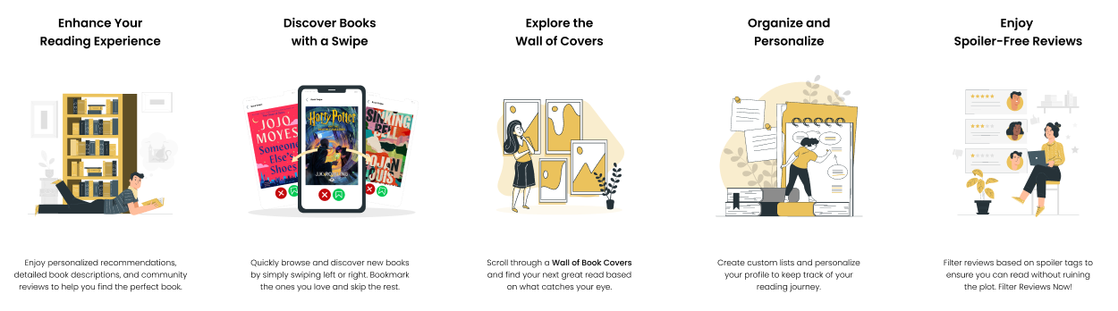
1. Swipeable Book Cards 📖
Problem Solved: Overwhelming book discovery process.
Solution: A Tinder-like interaction where users can quickly swipe through books, bookmarking or dismissing selections based on preferences.
2. Book Cover Wall 🖼️
Problem Solved: Virtual Library Experience + User-Friendly Interface
Solution: Users browse a grid of book covers, simulating the experience of exploring bookshelves in a real library.
3. Mood-Based Discovery 🌙
Problem Solved: Limited filtering based on user mood.
Solution: Allows users to filter books based on their current mood, adding a layer of personalization for recommendations to match individual emotional states. It enhances the user experience by making the app more responsive to personal preferences and moods.
4. Enhanced Tagging System 🏷️
Problem Solved: Generic book categorization.
Solution: Introduces detailed tags for books, covering elements like writing style, pacing, themes, and reader sensitivities (content warnings).
5. Author-Based Discovery ✍️
Problem Solved: Difficulty in discovering new or underrated authors.
Solution: It helps users make informed selections by highlighting authors who might otherwise go unnoticed. It also gives users a new and efficient way to expand their reading lists, making their overall experience better.
User Persona:
I identified these focus areas to lay the groundwork for creating an application prototype design that resonates with the users and meets their needs effectively using the key insights from the literature review. To ensure that the design decisions are aligned with our users’ preferences, the next step involves creating detailed user personas.


Branding 🎨
Branding Identity
My application’s brand identity aims to be cheerful and approachable, encouraging users to read more books. I wanted the design to be friendly and supportive, helping users stay focused on finding the best book they would want to read feel positive about their progress.
Branding Colors and Typeface
Choosing the best brand colors was challenging, as it involved more than just selecting attractive shades; I had to prioritize user experience while balancing my enjoyment of experimenting with different aesthetics.
Initial moodboard
I created several iterations of the brand color moodboard before finalizing the best one. For the initial mood board, I chose colors that reflect the depth of experience and knowledge that books bring to readers, much like the mysterious depths of the ocean. This led me to choose shades of ocean blue, white, and a hint of grey.
Although the colors looked beautiful in the moodboard, they didn’t quite match my vision when combined with the typeface. They didn’t work as well as I had hoped when I tried to apply to a temporary mock design screen of the application.

1st Iteration of the moodboard
After iterating on the initial moodboard, I aimed to achieve better contrast in the branding by adding yellow. I also began developing the typeface, which led me to establish the initial final branding colors. However, when I later combined the colors with the typeface for the logo, I realized they didn’t align well with the concept I envisioned for the book recommendation app and the experience I wanted to create for users as well as on the design screen. I had to come up with another mood board later since this happened twice now.

Working on the application name
I came up with a few potential names for the application during my initial research and brainstorming. Here are few of them:
1. Book Sage
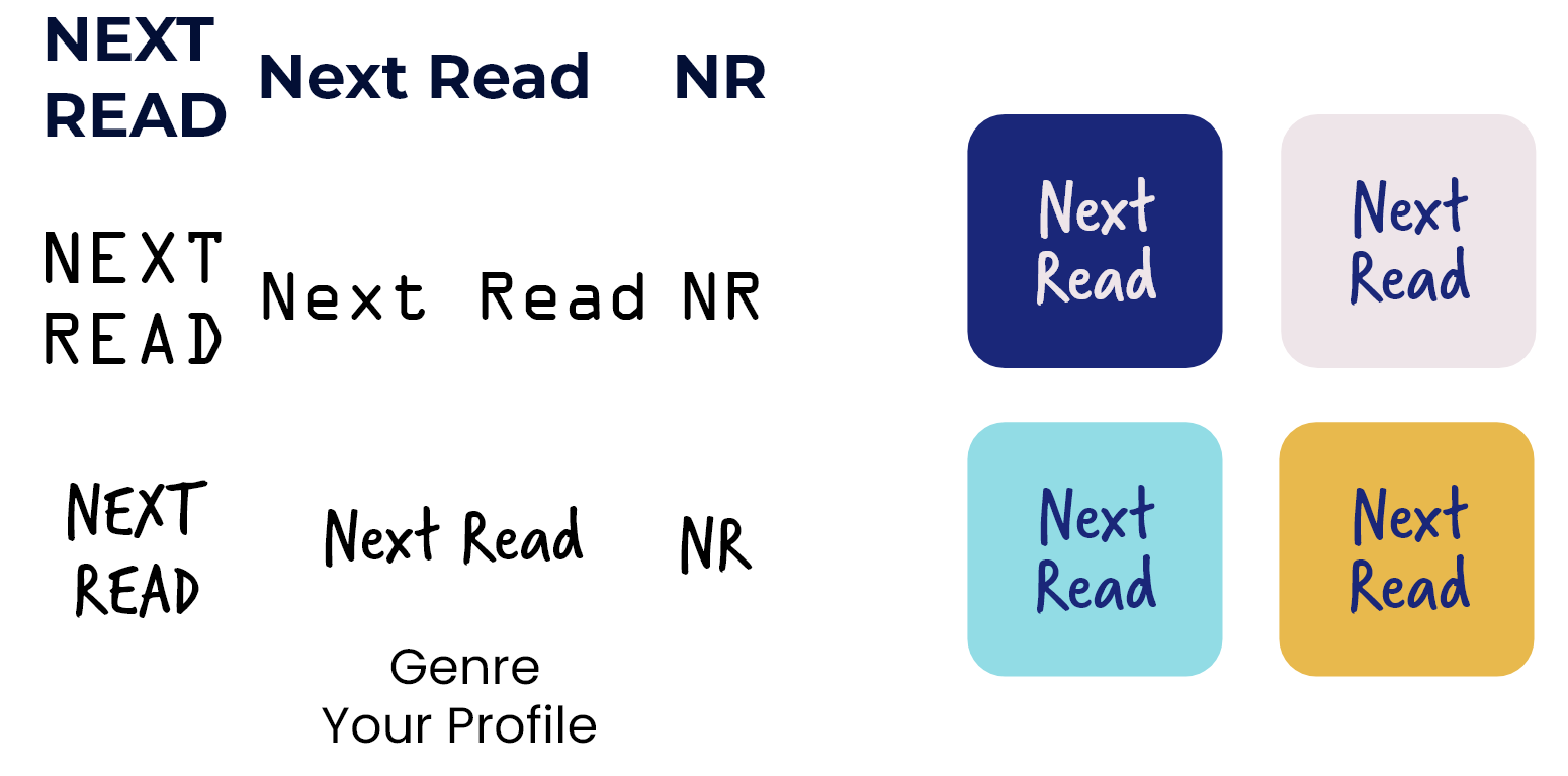
2. Next Read
3. Your Read
4. Book Sense
5. Know Your Read
6. Know Your Book
7. Read Right
‘Next Read’ was the final choice because it immediately and clearly communicated the application’s purpose to users. It was both precise and straightforward.
Branding iterations - Adobe Illustration boards
I experimented with various typefaces to find a complementary duo that would work well together, ensuring consistency and harmony of use and aesthetics in the overall design.

Simultaneously, I focused on selecting the ideal typeface for the logo to enhance its visual impact and align with the brand’s identity. Throughout this process, I also carefully worked on coordinating the chosen colors with the brand logo to achieve a cohesive and appealing visual representation.
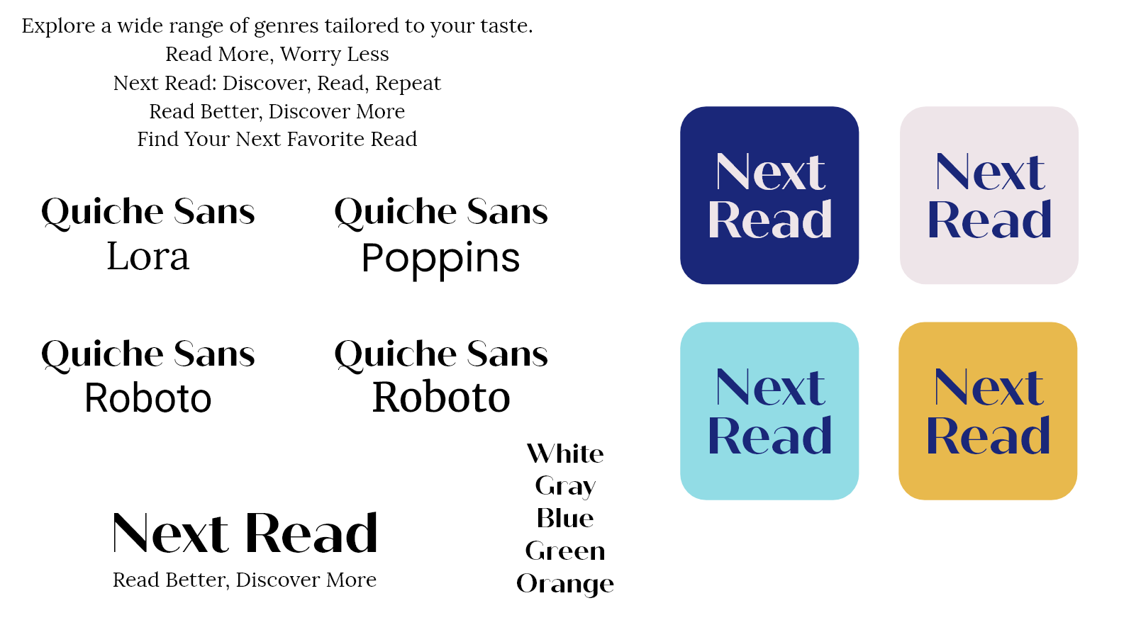
I brainstormed various taglines for the brand and settled on ‘Read Better, Discover More.’
While searching for the right typeface for the logo, I found that ‘Quiche Sans’ was the best fit for the brand’s identity as the main typeface. To complement it, I chose ‘Lora’ for the secondary typeface.
However for the colors, as I mentioned earlier, the initial color combinations didn’t work as well as I hoped. So, I created another version of the mood board to finalize the colors.
Final moodboard and explaining color choices:
This is the final moodboard I finalised for the brand colors.

Yellow Background (#EBC25C) : The warm yellow background creates a friendly and inviting feel, perfect for the logo. Yellow suggests optimism and creativity, making the app stand out and grab users’ attention.
Black Text and Graphics: Black text and graphics provide strong contrast against the yellow, making the logo easy to read. Black adds a touch of sophistication and balance, giving the app a professional yet approachable look.
Brainstorming Logo Ideas:
Here are some logo ideas I sketched. I wanted the logo to be simple yet catchy for readers. I designed these concepts to see how they would look.

Final Branding:
Wireframing & Prototyping
The prototype link is on the very top of this page with the dissertation report.
🔝
The prototype link is on the very top of this page with the dissertation report. 🔝
User Testing & Feedback
Future Enhancements
Self-Evaluation
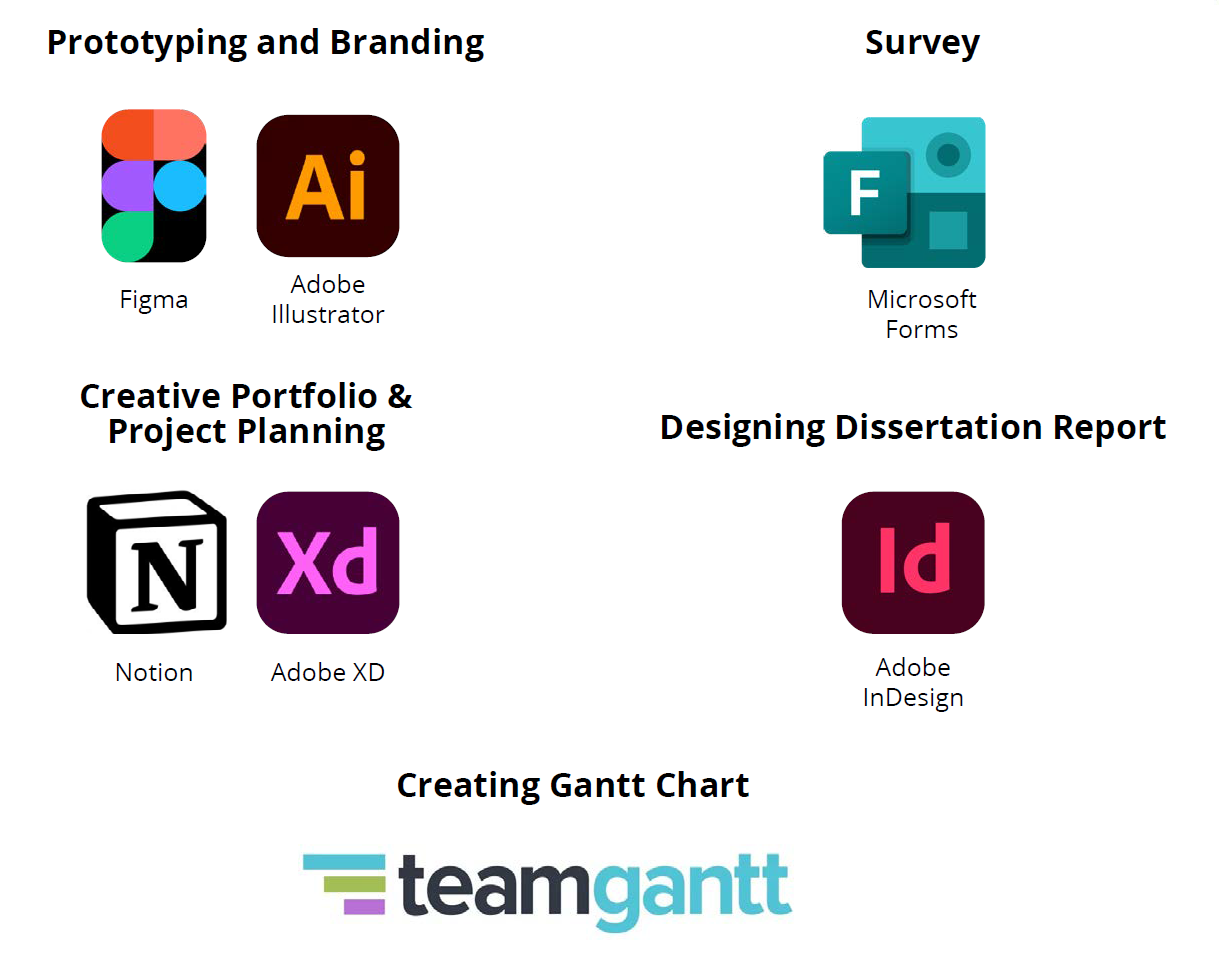
Tools & Technologies Used
Once the features were finalized, I developed low-fidelity wireframes to map out the app’s user flow and interactions. Using Figma, I built the prototype in stages:
Wireframes & Low-Fidelity Design – Focused on layout, navigation, and structuring the content hierarchy.
High-Fidelity Screens – Incorporated final branding, typography, and UI components for a polished interface.
Prototyping & Interactions – Implemented micro-interactions such as the book swipe feature, animated transitions, and dynamic filtering.
🔗 Prototype Link: Next Read - Final Prototype
Final list of screens to design:
1. Splash Screen
2. Onboarding Screens:
a] Book card swipe feature
b] Book cover wall feature
c] General features
d] Lists/ user profile features/custom tags
3. Account login:
a] Sign in
b] Sign up
4. Profile Set-up
a] Reading goals/ discovery goals
b] Favorite genre
c] any genre or anything you would like to avoid?
d] Book length preference
e] Favorite authors
f] Books you’ve read (search)
g] Would you like to join a community (or later)
h] Sync with goodreads or others (or skip)
i] You’re all set, start discovering your next read
Design references for wireframes
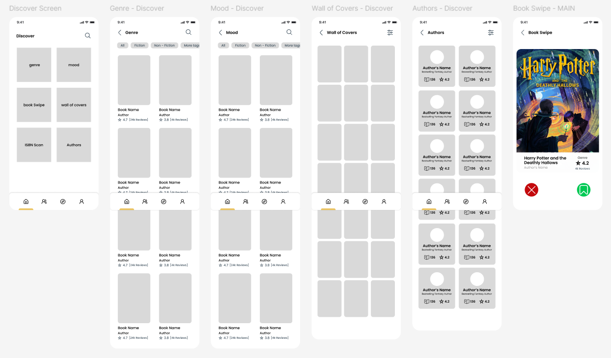
5. Home Screen
6. Discover Screen
a] Book Card Swipe - quick add to bookmark
b] Author based search
c] Mood based search
d] Camera search
e] Book cover wall
f] Genre
7. Search Result Page
8. Author’s Profile page
9. Community Screen
10. Book Description Screen
11. User Profile


Revisions:
At this point, I took time to carefully go through all the screens I had created. I focused on how each design worked, how easy it was to use, and whether everything felt consistent and aligned with the overall look and feel of the project.
I also explored different versions of some key screens—comparing their strengths and weaknesses to decide which ones worked best for the users and the project goals. This step helped me spot what needed improvement and fine-tune the designs before moving on.
The feedback and observations from this stage played a big role in shaping the high-fidelity screens used in the final prototype.
Here are some of the screens that were updated or chosen from different design options:
1] Book Description Screen - Content and Style Tab
I noticed that the ‘Content Warnings’ section was missing from the book description screen. This feature is essential for providing users with warnings about sensitive content. It was something I had planned to include based on my research analysis. After recognizing this oversight, I ensured that it was added during the high-fidelity design phase to keep the application aligned with its goals.
I conducted a survey with six participants to evaluate the prototype’s usability and features. The survey included a link to the prototype, which participants were required to interact with before filling out the survey. This ensured that all responses were based on their actual experience with the prototype.
The survey results from the six participants are added below as screenshots, followed by an in-depth analysis and insights based on their responses. The results reflect a range of opinions on aspects such as ease of use, design, and functionality, as well as areas for improvement.
Survey Insights Summary 💡
To validate the usability and effectiveness of the prototype, I conducted a user survey with 6 participants. Here's what the feedback revealed:
1. Overall Experience & Navigation
Users rated the prototype 4.83/5 on average.
Most found the navigation very intuitive and easy to use.
2. Clarity & Confusion Points
The interface was generally clear, but a few users noted minor confusion with:
Book swipe loading time
Profile layout
Locating reviews and book ratings
3. Community Features & Filtering
5 out of 6 participants found community features extremely easy to use.
All users agreed that these features enhanced their overall experience.
Filters were effective, though some suggested more advanced options.
4. Discover Section & Wall of Covers
Discover features were highly rated for ease of use.
The Wall of Covers was a favorite—all users felt it helped with book discovery.
5. Quick Swipe Book Cards
Universally praised for being smooth, intuitive, and helpful in discovering new books.
6. Tags & Filtering
All participants agreed tags made book browsing easier.
Suggestions included expanding filters and the ability to request new tags.
7. Book Descriptions & Visual Design
Detailed book descriptions helped users better understand book content.
Visual design, including colors and typography, was well received.
A dark mode option was requested.
8. Responsiveness & Personalization
The prototype was responsive overall, with minor button delay issues.
Personalized book recommendations and filters were highly appreciated.
9. Performance & Expectations
Features like the Wall of Covers and Quick Swipe exceeded expectations.
Some users found it better than other book apps they had used.
10. Areas for Improvement
Key feedback included:
Faster swipe feature load time
Simplifying genre selection during sign-up
Adding dark mode and enhancing user profiles
11. Engagement & Future Use
5 out of 6 users said they would definitely use the app once launched.
Suggested additions included audio excerpts and a “skip” button for Quick Swipe.
Creating this project was both a rewarding and challenging experience. It was my first time developing a concept of this scale—from early ideation to a functional prototype—and it pushed me to grow across multiple areas of design and research.
Throughout the process, I refined my skills in UX design, user research, and project planning, while also learning how to adapt and make thoughtful decisions as the project evolved. There were definitely moments of uncertainty, but each stage helped me identify areas for improvement and set clear goals for future growth.
Overall, this project has been an incredible learning journey that strengthened both my creative process and my confidence as a designer.
Project artefact - Application Prototype:
Designing the artefact was truly exciting for me because I got to see an idea I had in my mind come to life through my design skills, which I’ve been working hard to improve throughout my time at university. As a computer science student transitioning into design for my master’s, learning everything within a year was definitely challenging. But when I look back at how far I’ve come—from where I started to the progress I’ve made since my first UI/UX module project for a website—it feels like a significant personal achievement. It’s been a rewarding experience, especially as someone new to the design world.
The prototype turned out even better than I expected, especially since I was initially worried about executing the design properly. The new discovery features I introduced were well received by the users during the evaluation, which gave me a real confidence boost. It helped me believe more in my ideas and approach future designs with less hesitation and more assurance in my abilities.
I’m really happy with how the screen designs turned out, especially successfully implementing the Tinder-like swipe feature for books. I aimed to include as many screens as possible within the time frame to give users a well-rounded experience that felt like a real application. Though I wish I had more time to fully refine every nook and cranny of the application and include every screen necessary for it to feel truly complete. While there were additional features and small details I wanted to refine, I had to push those to future suggestions, which I’ll discuss later in the dedicated section.
Some users mentioned an issue with the loading time of images during the prototype evaluation. However, I later clarified to them that this delay was due to the high-quality images used in the prototype. In a fully developed application, this wouldn’t be a problem, as the loading times would be much faster, ensuring smoother performance overall. I had actually noticed the image loading issue myself while testing the prototype before sending it out for evaluation. Unfortunately, there wasn’t much I could do about it at the time, as it seemed to be an issue with the Figma application or just how it functions with high-quality images.
For improvements, I realize I need to focus more on refining interaction implementations. Some interactions in the prototype didn’t work out exactly as I had envisioned, so I had to slightly adjust the design to accommodate these limitations. For instance, I wanted the filters with tags to appear more fluidly on the screen when tapped. While the final result looked good, it wasn’t as polished as I had hoped. Additionally, I struggled with reusing the same screens for similar interactions, like the book description screen for multiple books. Instead of reusing them efficiently, I ended up duplicating screens for each book, which was time-consuming and frustrating. This showed me that I still have a lot to learn when it comes to more advanced design techniques.
I realized after user evaluation that some screens could use further refinement to improve the user experience, as pointed out by a few users during feedback, such as adding more details to the Book Swipe and User Profile sections. Since my main focus was on enhancing the selection process and exploring new discovery features, I wasn’t able to fully address the limitations on other screens. Now that I take a step back and examine the prototype, I notice the small details I missed. However, I plan to continue working on this application even after submitting my dissertation with improvements and aim to bring it to life for real users to enjoy. (not necessarily right away though 😬)
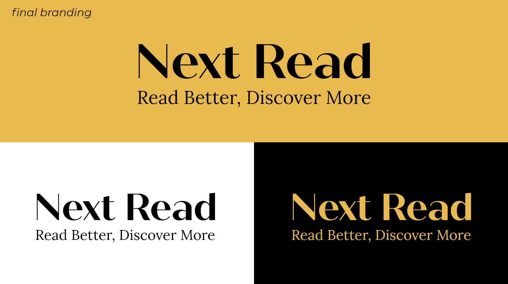
Typeface:
Quiche Sans Font: It evokes a sense of quality and refinement, enhancing the app’s branding.
Bold and Readable: A bold Quiche Sans font ensures readability on small screens and helps the logo stand out, making it memorable and effective in a crowded market.
Graphical Elements:
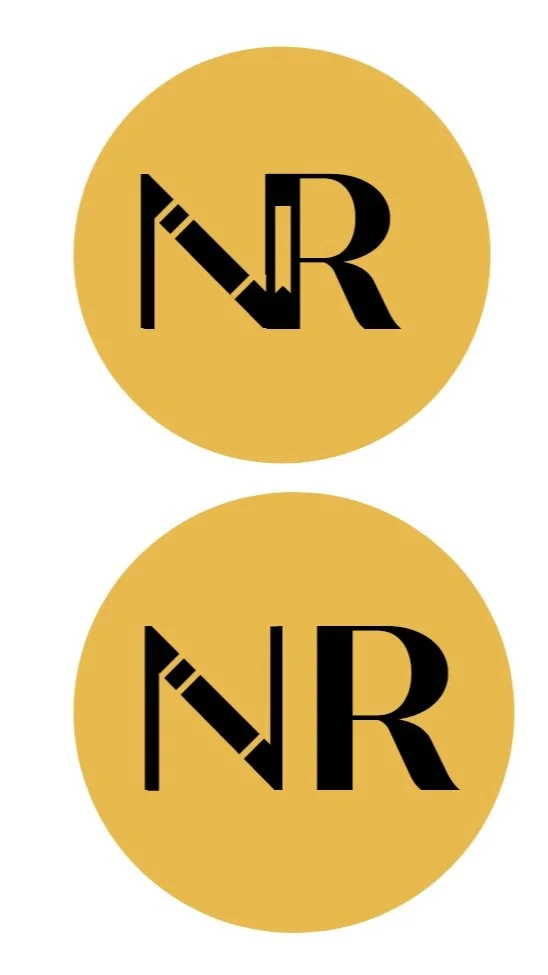
Bookmark Icon: This icon combines a book and a bookmark, clearly linking the logo to reading. It’s a straightforward and simple symbol that helps users quickly grasp the app’s focus on books.
Text Layout:
The full ‘Next Read’ logo is clear and detailed, ideal for primary branding.
The ‘NR’ version is a simplified logo for smaller spaces like app icons and social media. Both versions use the bookmark graphic for consistent branding.
Overall Impact:
The design clearly communicates the app’s purpose, builds trust, and stands out visually, making it effective across various platforms.
This finalizes the branding for my book recommendation application.
Information Architecture and User Flows
To create the information architecture and user flows, I began by grouping the various features into four main application tabs: Home Screen, Community Screen, Discover Screen, and User Profile.
This organization helped establish a clear structure for the app, ensuring users could easily navigate between core areas. While working on it I considered adding more detailed elements to the book description but, after careful brainstorming, I realized that the points I had already finalized were well-suited and sufficient for the scope of my application.
The following images showcase my hand-drawn sketch from the brainstorming phase for information architecture.

Information Architecture

A Small Change to the Map:
There was a minor adjustment made to the “Discover” tab, specifically for the Book Card swipe interactions:
Before:
- Left swipe: Reject
- Right swipe: Add to list
- Swipe up: Book preview
After:
- Left swipe: Reject
- Right swipe: Add to bookmarks
I decided to remove the swipe-up interaction as I wasn’t entirely confident in how I would design it interactively. Additionally, I changed the right swipe to add books to bookmarks rather than a list, making it easier for users to organize their books later. This way, users can bookmark books first and then move them to their preferred lists, making the process easier.

Wireframes


While working on the screen designs, I experimented with some features to explore which would work best during the designprocess:
For the Book Card Swipe, I initially experimented with adding a swipe-up gesture for a book preview to test whether I could design it as an interaction. The left and right swipe actions were already new territory for me in terms of interaction design.
For books displayed on shelves in both user and author profiles, I wanted to implement a toggle option to switch between cover-facing and spine-facing views, similar to what you’d see in a library or bookstore.
On the Community Screen, I designed two different layout to see which one would offer the best user experience and ease of navigation.
For individual community pages, I originally designed a separate page that would display content for a specific community when tapped. However, I ultimately discarded this idea to meet the project deadline, as the main objectives needed to be showcased more effectively in the prototype.
Now that the groundwork is completed, I am ready to proceed to the low-fidelity and high-fidelity screen designing and prototyping, where these ideas will begin to take visual form, finally leading to the final product design.
Low-fidelity Design
In the early stages of the design process, I focused on developing low-fidelity designs to get the foundational structure and layout of the interface ready. Using wireframes as a reference, I created basic design screens to visualize the overall user flow and functionality.
I continuously reviewed and refined the low-fidelity screens throughout the design process. Based on my observations and insights, I made quick adjustments and improvements, which helped shape the designs and prepare them for the more detailed high-fidelity phase.


Book Card Swipe component:
I first created a reusable Book Card Component in Figma, which would allow me to maintain consistency across all book cards and enable easy interaction design for the swipe feature. Here’s a preview of the design:
2] User Profile Screen:
I initially planned to go with User Profile 2, but I decided to experiment with a different design, User Profile 1. However, the layout in User Profile 1 didn’t group the content as neatly as I had imagined, so I ended up finalizing User Profile 2 instead.
After making this decision, I added a toggle feature to switch between different views for the books displayed on shelves, which I had planned to include during the wireframe stage.

However, due to time constraints and the need to focus on more important aspects of the project, I had to save the toggle feature for future improvements.

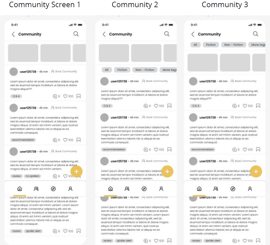
3] Community Tab Screen:
I designed three different variants of the Community Screen. The first, Community Screen 1, had no tags for filtering posts. In Community Screen 2, I added tags below the communities that the user was enrolled in. For the third variant, I placed the tags above the communities. The third variant offered the best user experience, so I selected it as the final design.
This concludes all the revisions I needed to consider before moving forward with designing the high-fidelity screens.
Final Prototype Design Revision
In the final stage of the design process, I focused on making small but important adjustments across the prototype. I carefully reviewed each screen, refined the finer details, and made sure the flow between screens felt smooth and natural.
To make sure everything worked as intended, I tested the full user journey from start to finish—just like a real user would. This helped confirm that all screens were connected properly and that the overall experience was intuitive and functional.
These final checks were key in making sure the prototype not only looked good but was also user-friendly and aligned with the project’s goals. With these last tweaks in place, the prototype was ready to move forward into user testing and future development.
Based on user feedback and personal reflection, I’ve identified several improvements to refine and expand the prototype experience beyond its current version. These recommendations focus on personalization, accessibility, and deeper user engagement:
User Control & Personalization 🧩
Bookmark Removal – Allow users to remove saved books for better content management.
Avoidance Filters – Let users filter out genres or tropes they don’t want to see.
Personalized Tags – Enable custom tagging to organize personal collections.
Discovery & Browsing 🔍
Trending Tab – A dedicated section for trending books, sorted by genre.
Similar Book Suggestions – Show related titles in the book description.
Series Organization – Group books from the same series together for easy navigation.
Swipe-Up Gesture in Swipe Cards – Let users swipe up on book cards to access more details.
Skip Option in Swipe Cards – Allow users to skip books without rejecting them entirely.
Bookshelf View Options – Offer a stacked side-view for a more visual browsing experience.
Content Access & Utility 📚
Purchase Links – Direct users to platforms where books can be bought or accessed.
eBook & Audiobook Indicators – Show availability of alternate formats for convenience.
Social & Community Features 💬
Spoiler Filters – Blur spoiler comments in reviews unless tapped.
Direct Messaging & Group Chats – Add private chat features to boost community interaction.
User Reviews Tab – A dedicated space in user profiles for their shared reviews.
Visual Preferences 🌙
Dark Mode – Offer a dark theme for comfort and accessibility.
These enhancements are part of my long-term vision for the app—ensuring it evolves into a thoughtful, community-driven, and user-friendly experience.
Thank you for taking the time to explore my project! I hope it gave you a clear insight into my design thinking, process, and the vision behind the concept. If you're interested in diving deeper—especially into the user survey, detailed responses, and analysis—feel free to check out the full dissertation report linked on the very top with the prototype. Your time and attention mean a lot! 😊